How a strategic rebrand helped Tribeca Flooring attract the right audience
- Maria M Torres Z
- Jan 21, 2024
- 2 min read

Updated: Apr 16
When Tribeca Flooring first approached me, their mission was clear: they wanted to be seen—not just by anyone, but by the right people. Their two locations in New York and New Jersey put them in prime territory, surrounded by interior designers and specifiers. Yet, despite this advantage, they were flying under the radar.
They weren’t just looking for a simple marketing push. They wanted to go big—with an event that would position their store as the destination for their target audience. But when I saw their existing branding, I paused.
And I was honest.
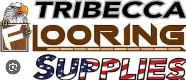
“I'm sorry, but your brand doesn’t reflect the feelings you want to evoke in designers and specifiers. Right now, you're talking to contractors.”
Yes! That's what they wanted me to work with.
The difference might seem subtle, but in branding, it’s everything. If you want to shift your audience, your brand needs to lead the way, to speak their language, to earn their attention and trust. Thankfully, they agreed—and so we began a full strategic rebrand.
The discovery: Finding the heart of Tribeca
I started with a discovery call with the owner and sales director. They laid out their goals, and I shared my expert point of view—what was working, what wasn’t, and what needed to happen for real impact.
Then the magic began.
I did a deep dive into the name Tribeca. I’ll admit it—I had no idea what it actually meant. But that moment of curiosity opened a rabbit hole of inspiration. “Tribeca” isn’t just a neighborhood. It’s a feeling. A design-forward, creative, aspirational vibe that lives in the world of architecture, texture, and intentional style.
That feeling became our north star.
The strategic rebrand: Building a brand that speaks their language
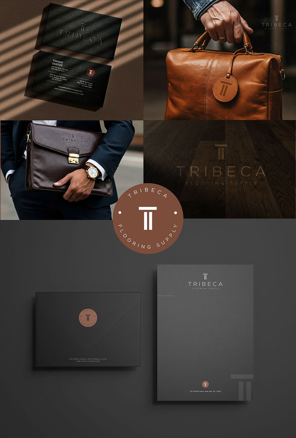
Once the essence was clear, we moved into visual direction. I submitted a refined, sophisticated color palette that echoed the elevated, minimal aesthetic designers gravitate toward. It was clean, modern, and understated—with a deliberate focus on less is more.
Then came the logo. I presented three custom concepts—each one created to reflect their expertise while resonating deeply with their new audience. We weren’t just designing a logo—we were designing a perception.
This wasn’t just about looking better. It was about becoming memorable.
Where They Are Now: A Brand with Presence and Purpose
With the rebrand complete, Tribeca Flooring Supply didn’t just show up at their event—they arrived. Boldly. Elegantly. Authentically.
And now, they’re not invisible anymore.
They’re a name designers and specifiers remember.
Comments